📲 Prefer a quick visual summary? Explore our Web Story: Bedroom Color Psychology in Interactive Slides.
After a long day of nonstop meetings, city traffic, and glowing smartphone screens, all our body and mind truly yearn for is a peaceful sanctuary to unwind. Have you ever noticed how stepping into a bedroom painted in just the right calming hue brings an instant wave of relief—almost like setting down an invisible backpack? The colors that surround our bed speak directly to our subconscious, gently guiding our heart rate, breath, and evening melatonin levels into natural rest.
Transforming your bedroom into a deeply restorative haven does not require an overwhelming remodel. Very often, rolling a fresh coat of soothing paint onto the wall behind your headboard, switching to natural linen sheets, and adding a warm reading lamp creates an immediate, life-changing shift.
Your Bedroom as an Evening Embrace
Your bedroom is the most personal space in your entire home. Unlike the living room or kitchen, which thrive on energetic conversation and movement, the bedroom should be a sanctuary of stillness and decompression.
When your eyes register soft, velvety tones upon walking through the door, your nervous system gets the memo: it is time to drop your guard, let go of tomorrow's to-do list, and breathe deeply. In contrast, glaring colors or jarring high-contrast patterns keep your brain in daytime alertness, making it much harder to drift off into restful sleep.
Misty Blues, Soft Foliage Greens, and the Touch of Nature
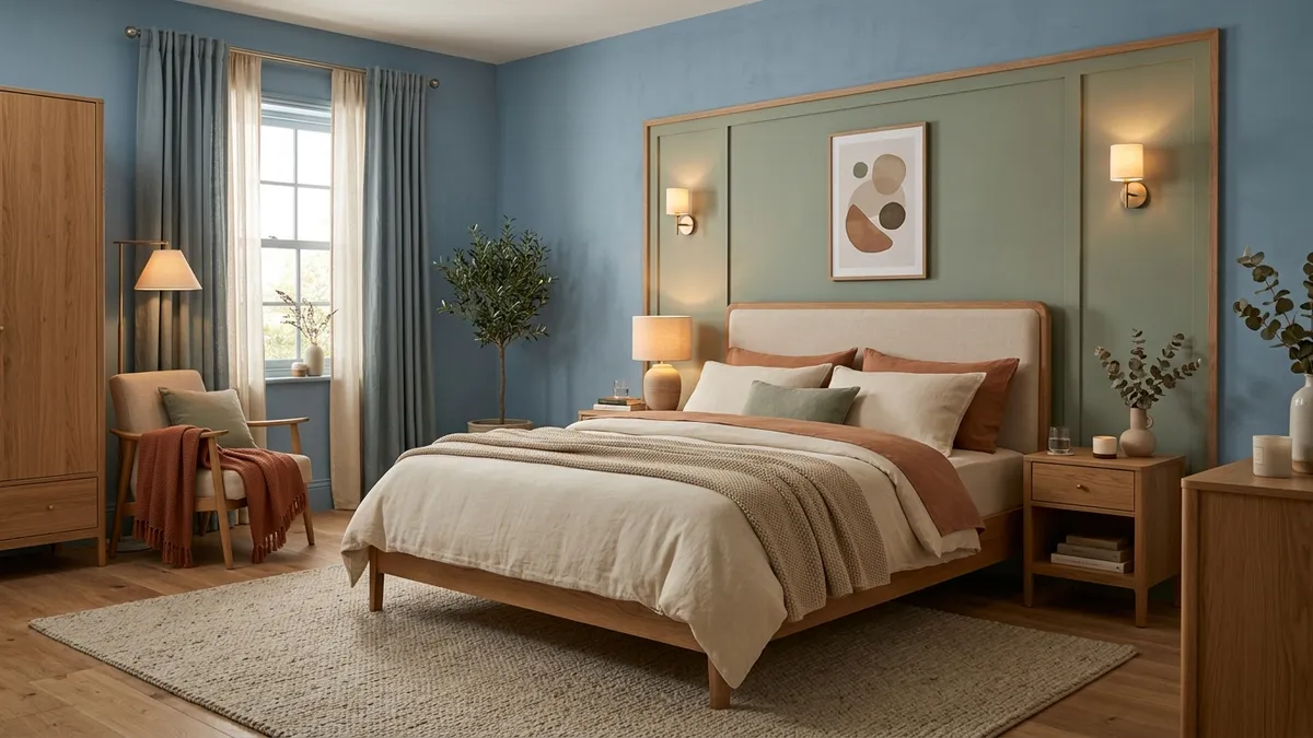
If there is one color universally loved for its soothing properties, it is blue. Sleep research consistently shows that dusty, muted blues—like misty slate, morning cloud, and pale denim—remind our minds of open horizons and cool breezes, naturally lowering heart rate and pulse.
Another gorgeous choice is soft botanical green—think pale sage, eucalyptus, or muted olive. Because green is the most abundant color in the living natural world, our brains instinctively associate it with shelter, renewal, and quiet vitality. Painting the wall behind your bed in a flat matte sage green and adding a leafy bedside plant creates the comforting feel of a peaceful woodland cabin.
Warm Sand, Muted Terracotta, and Earthy Comfort
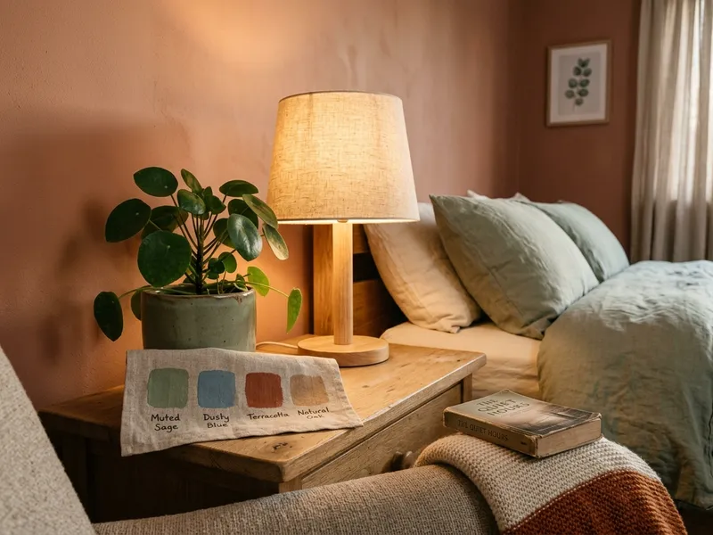
If you prefer your room to feel warm, grounded, and cocooning, earthy neutrals and warm mineral tones are unbeatable. Steer clear of clinical hospital-white paint and instead embrace welcoming shades like warm oatmeal, sand, unbleached linen, and soft greige.
Subtle touches of muted terracotta, dusty rose, or warm camel—woven into throw blankets, accent pillows, or textured art—bring that cozy countryside feeling that comforts you on chilly nights. Paired with a warm wood headboard and a plush rug under bare feet, your bedroom feels like an exclusive boutique retreat.
Colors to Keep Away from Your Bed
To protect your bedroom as a pure zone of peace, save high-voltage colors for your home office or fitness corner. Saturated cherry reds, neon yellows, and electric oranges are visual stimulants that trigger mental excitement and wakefulness—not what you want when trying to fall asleep.
If you love these lively colors, enjoy them as small accent details, like the cover of a favorite book or a scented candle on your dresser, keeping the large canvas of walls, drapes, and bedcovers serene and quiet.
Quick Guide: Which Calming Bedroom Palette Fits You?
| Color Palette | Recommended Shades | Atmosphere & Mood | Pairs Beautifully With |
|---|---|---|---|
| Misty Blue Serenity | Misty slate blue, soft chambray, and crisp linen white | Cool, airy, mental lightness, and calm breathing | Light blonde wood millwork and crisp white cotton sheets |
| Botanical Sage | Pale sage, muted olive, and warm sand | Grounded, fresh, restorative connection to nature | Natural rattan, leafy house plants, and woven wool rugs |
| Earthy Cocoon | Soft terracotta, oatmeal, greige, and warm off-white | Warm embrace, safety, and cozy boutique comfort | Warm 2700K bedside lamps and chunky knitted throws |
| Quiet Minimalist | French greige, raw linen, and soft alabaster | Visual clarity, spaciousness, and understated elegance | Floor-to-ceiling linen draperies and upholstered headboards |
Frequently Asked Questions on Bedroom Colors
What is scientifically considered the most relaxing wall color for bedrooms?
Soft, muted blues (such as misty blue or slate grey-blue) are consistently proven to promote the deepest relaxation. Blue wavelengths gently lower heart rate and blood pressure, signaling to your brain that the active day is done and it is safe to rest.
Are pure stark white walls good for a cozy bedroom?
Bright, stark white reflects artificial light harshly and can feel sterile or clinical. For a truly restful bedroom, choose warm off-white shades like soft alabaster, linen, warm oatmeal, or gentle greige that comfort your eyes.
Which colors should be avoided in the master bedroom?
High-energy vibrant colors—such as intense cherry red, electric orange, and neon yellow—should be kept away from large bedroom walls. They stimulate adrenal focus and eye strain, interfering with your natural evening melatonin production.
How can I preview different paint colors on my bedroom walls before buying paint cans?
Take a photo of your bedroom with your smartphone and upload it to the Arquitet IA app. Within seconds, you can preview photorealistic 3D concepts showing different paint colors, headboards, and bedding in your exact space.
Find Your Dream Bedroom Color with Arquitet IA
Curious how your bedroom would look with a calming sage green feature wall, soft misty blue, or warm terracotta before buying paint? Take a quick smartphone photo and test dozens of colors in 3D using the Arquitet IA app.
Simulate Bedroom Colors Free →