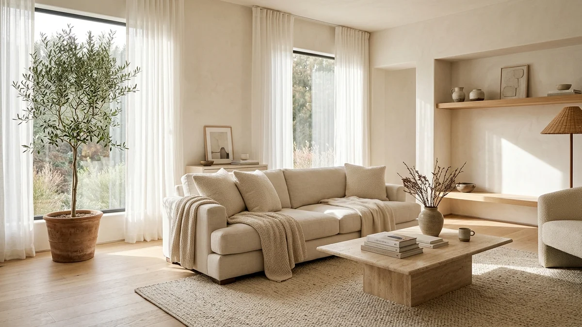
After a long day navigating bright digital screens, busy traffic, and endless notifications, the one thing we crave most when stepping inside our home is quiet, visual calm. This desire explains why minimalist design centered around neutral color palettes has become so universally loved. Far from being an empty trend, choosing shades of sandy beige, warm white, linen, and soft gray directly influences how our minds unwind, creating an atmosphere where genuine rest and rejuvenation feel effortless.
A Rest for the Mind: How Neutral Colors Ease Sensory Overload
Loud, saturated colors demand continuous subconscious effort from the brain to process contrasting visual stimuli. When every corner of a room competes for attention, truly relaxing becomes difficult.
Neutral palettes create gentle, uninterrupted transitions across walls, upholstery, and flooring. Without abrupt visual breaks, your gaze glides smoothly through the interior, fostering immediate mental clarity and an innate sense of order.
This calming effect is especially valuable in bedrooms and living rooms, where soft surroundings signal our nervous system that it is safe to slow down and recharge.
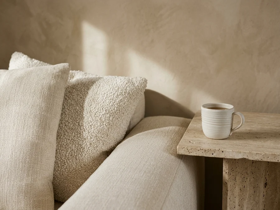
Tactile warmth: layering washed linen, textured bouclé, and travertine stone brings rich domestic comfort to neutral palettes.
Amplifying Daylight: Creating Spaciousness in Any Room
Another remarkable benefit of light neutral tones is their natural ability to reflect and distribute sunlight. Unlike darker paints that absorb brightness, warm off-whites and sandy creams act as gentle daylight reflectors.
Even in compact city apartments or rooms with smaller windows, natural light bounces freely across pale surfaces, illuminating shadowy corners and making the whole room feel open and expansive.
This luminous quality creates the impression of higher ceilings and wider walls, eliminating cramped feelings and making everyday living noticeably more enjoyable.
Warm Minimalism: How to Avoid a Cold or Clinical Look
A common hesitation when adopting minimalism is the fear that a home might look sterile or institutional. The secret to keeping neutral interiors warm and inviting lies in rich, tactile textures:
Layered Natural Fabrics: Instead of varying bright paint colors, vary touchable textures. Pair an unbleached linen sofa with bouclé pillows, wool throws, and sheer cotton curtains for immediate softness.
Natural Blonde Wood: Light oak, ash, and natural cane introduce organic warmth that balances pale walls with timeless craftsmanship.
Matte Stone and Ceramics: Travertine coffee tables, handcrafted clay vases, and ribbed ceramic mugs catch subtle shadows that delight the eye with quiet sophistication.
Living Greenery: An indoor olive tree or potted fiddle-leaf fig adds vibrant green freshness that stands out beautifully against calm neutral backgrounds.
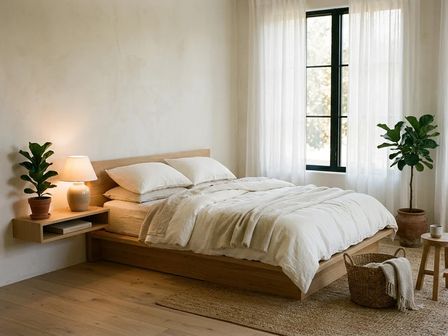
Restorative haven: a minimalist bedroom in pale wood and linen bedding invites deep, peaceful sleep.
Simple Ways to Introduce Neutral Calm into Your Routine
You do not need to replace all your belongings to enjoy minimalist peace. Small, intentional updates make a noticeable difference:
Choose paint shades with warm undertones like oat, sand, or linen white rather than stark cool whites that can feel chilly under artificial lighting.
Upgrade your bedding and sofa cushions to breathable natural cotton or washed linen in ivory and beige tones. With fewer clashing colors, your living space gains an enduring elegance that never goes out of style.
Visualizing Neutral Interiors with Arquitet IA
Before investing in paint cans or ordering new furniture, you can explore how warm neutral palettes and natural textures will look in your actual home with Arquitet IA.
Simply upload a photo of your living room or bedroom on your phone to preview sand-toned walls, linen sofas, oak furniture, and soft lighting in seconds, giving you total confidence before making changes.
Frequently Asked Questions
Why does minimalist design rely so heavily on neutral colors?
Neutral tones like warm white, sandy beige, and soft gray reduce visual clutter, giving our brain a break from processing high-contrast stimuli. They also reflect natural sunlight effectively, making living spaces feel larger and brighter.
How can I keep a neutral minimalist home from feeling sterile?
The secret lies in warm minimalism: layer tactile materials such as washed linen, cozy bouclé pillows, natural oak wood, textured travertine stone, soft wool rugs, and lush green potted plants.
Which neutral paint shades are best for living rooms and bedrooms?
Warm off-white, oat, sand, soft linen, and greige work beautifully. They avoid cool blue undertones that can make rooms feel clinical, instead providing a gentle sun-kissed warmth.
Do light neutral colors help reduce electric lighting needs?
Yes. Light walls and upholstery bounce ambient daylight across the room, illuminating dark corners and keeping rooms naturally bright throughout the day without turning on artificial lights.
How can I preview a neutral minimalist palette before repainting?
With the Arquitet IA app, simply take a photo of your living room or bedroom on your phone to simulate neutral paint shades, linen fabrics, and wood finishes in seconds before buying supplies.
📱 Turn Your Home into a Peaceful Haven
Ready to refresh your living room or bedroom with soothing neutral tones and warm textures? Download Arquitet IA to test new palettes and furnishings on your photo in seconds.
Try Arquitet IA Free