The Brown Glass Scandal: Why 1970s Kitchens Were Dominated by Amber, Orange and Chocolate Brown

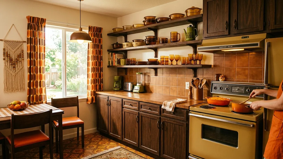
1970s kitchen with amber, burnt orange and chocolate brown color palette — harvest gold appliances, smoked Pyrex and Duralex glassware on open wooden shelves, macrame wall hanging

If you open the kitchen cabinet at your grandmother's house, there's a good chance you'll find amber-tinted Duralex glasses, a burnt-orange Pyrex casserole dish, or some bright orange plastic utensil that survived decades of use. These objects aren't accidental survivors of another era — they are the remnants of one of the most deliberate and coherent design aesthetics of the 20th century. The 1970s kitchen was intentionally brown, orange, and amber. And the story of why that happened — and why this palette has come back with force in 2024 and 2025 trends — is far more fascinating than it might seem.

"Brown isn't a color. It's a state of mind. And in the '70s, everyone wanted that state of mind in their kitchen." — Ellen Lupton, Cooper Hewitt Museum curator, on postwar domestic design.

1. The 1970s Palette: Much More Than a Passing Fad

Before understanding the objects, you need to understand the context. The 1970s kitchen didn't emerge from nowhere — it was the result of a chain of cultural, economic, and technological decisions that began in the postwar period and exploded at the turn of the 1960s into the 1970s.

The dominant colors of the era had names that sound almost comical today: Harvest Gold, Avocado Green, Coppertone, and Burnt Orange. These were the four official colors that the American appliance industry — led by General Electric, Frigidaire, and Whirlpool — adopted as their standard palette for the entire domestic line. Refrigerators, stoves, washing machines, blenders, and toasters: all available in these four colors.

It was no accident. It was a calculated marketing decision to replace white — the dominant appliance color since the 1920s — with something that felt warmer, more organic, more connected to nature. The emerging environmental movement of the 1960s, the hippie counterculture with its love for wood, straw, and earth, and the back-to-nature wave dominating popular culture — all of this translated in the domestic kitchen into earthy and amber tones.

The Burnt Orange and Harvest Gold also carried connotations of prosperity and abundance. After postwar austerity and the relative sobriety of the 1950s, the 1970s were an era of middle-class expansion — especially in the US and Western Europe. Owning a Harvest Gold refrigerator was a signal that you had made it.

2. Pyrex and Duralex: The Science Behind Amber Glass

No object represents the 1970s kitchen more precisely than a set of amber Pyrex casseroles or smoked Duralex glasses. But why were these glasses brown and orange? The answer involves physics, marketing, and a very convenient historical accident.

Pyrex was created in 1915 by Corning Glass Works in the United States, using borosilicate glass that could withstand thermal shock — going from freezer to oven without breaking. Initially transparent, Pyrex became a popular kitchen item in the 1940s and 1950s. The shift to amber and earth-tone colors came in the 1960s for a genuine technical reason: metal oxides added to glass to create amber color also increased the material's resistance to UV radiation — relevant for food packaging and storage.

But there was another factor: iron oxide, the main agent for the amber-brown tone in glass, was cheaper than other glass pigments. An amber Pyrex piece cost less to produce than a high-quality transparent one, and marketing transformed this cost limitation into an aesthetic advantage.

French Duralex — founded in 1927 in La Chapelle-Saint-Mesmin — followed a similar path. Its industrially tempered glass naturally produced a slightly smoked coloration in most furnaces of the era when stabilizing compounds were added. Smoked Duralex wasn't an aesthetic whim: it was a direct consequence of the industrial tempering process and the available materials. But, once again, marketing transformed the limitation into identity.

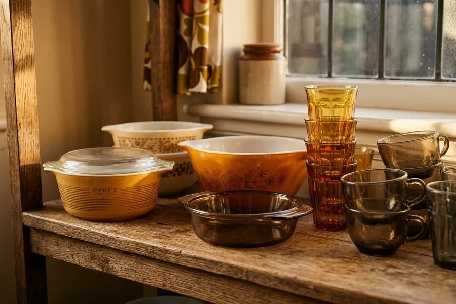
Collection of vintage Pyrex and Duralex in amber, smoked brown and harvest gold tones — casserole dishes, mixing bowls and glasses from the 1960s and 1970s arranged on a wooden kitchen shelf

Vintage Pyrex and Duralex collection — the amber and smoked glass that defined 1970s kitchen aesthetics. Today, original pieces are sought after at flea markets and antique stores worldwide.

3. Avocado Green and the Palette's Siblings: A Color Family with Internal Logic

Orange and amber didn't exist alone. They were part of a cohesive chromatic family with sophisticated internal logic — even if no one described it that way at the time.

The complete 1970s kitchen palette was:

  • Harvest Gold — the golden-yellow of large appliances (refrigerators, stoves)
  • Burnt Orange / Coppertone — the burnt orange of utensils and accessories
  • Avocado Green — the mossy avocado green as accent and counterpoint
  • Chocolate Brown — the dark brown of woods, tiles, and wall coverings
  • Amber / Smoked Glass — the tone of Pyrex, Duralex, and other glassware

What unites these colors? They are all analogous to terracotta — they rotate around the red-yellow-brown spectrum of the color wheel. In color theory, they evoke earth, wood, fire — natural elements. The Earth Tones movement of the 1970s was, in this sense, the aesthetic response to the environmental anxiety of a generation that had grown up under the threat of nuclear war and woken up to the ecological crisis.

Interestingly, this palette also worked extraordinarily well under incandescent lighting — the only domestic lighting available at the time. The yellow glow of tungsten bulbs warmed the amber and orange tones, making them even warmer and cozier. Under cold white fluorescent light — which would come to dominate subsequent decades — the same palette appeared somber and depressing. This partly explains why the aesthetic "aged" so quickly when domestic lighting changed in the 1980s and 1990s.

4. The Fall of the 1980s and the 2020s Nostalgia Revival

The turn from the 1970s to the 1980s was cruel to the amber palette. Interior design of the 1980s was a violent and deliberate reaction: glossy white, steel gray, metallics, and black. The Memphis Design Group, launched in Milan in 1981, used saturated pop colors and absurd geometric patterns precisely as an antidote to 70s earth tone boredom.

Harvest Gold and Burnt Orange disappeared from appliance catalogs almost instantly. By 1985, it was practically impossible to buy a colored refrigerator in the US — white had reclaimed absolute dominance. The process in Europe and other markets was slightly slower, but equally definitive: by the mid-1990s, the "modern" kitchen was white, beige, or light gray.

Amber Pyrex and smoked Duralex were relegated to the backs of cabinets, then to second-hand markets, then to oblivion — until the Internet resurrected everything.

The revival began around 2015, first on online antique platforms (Etsy, eBay). Vintage Pyrex collectors had existed since the 2000s — but the scale exploded when Instagram made visually desirable any object that generated a "vintage aesthetic" photograph. An amber Pyrex casserole on a white marble countertop, lit by a morning window, is a genuinely beautiful photograph. The chromatic contrast is elegant.

In 2022 and 2023, the movement gained editorial dimension: magazines like Architectural Digest, House Beautiful, and Elle Decor published features on "the return of earth tones" and "the contemporary retro kitchen." Designers began intentionally specifying caramel tiles, dark wood cabinets, and amber utensils in high-end projects.

By 2025, brands that had abandoned "retro" colors were reversing course. Smeg launched refrigerators in Cream and Pastel Orange. KitchenAid re-released the stand mixer in Honey and Spiced Honey. Le Creuset saw sales spike for its pots in ochre, terracotta, and amber tones.

🟠 Test Earth Tones in Your Kitchen

Want to see how amber, terracotta, and harvest gold look in your kitchen before buying a single tile? Use Arquitet IA to visualize the 70s palette in your actual space.

Try Retro Palette with Arquitet IA

5. How to Use the 70s Aesthetic in a Contemporary Kitchen Without Making It a Museum

The difference between "retro homage" and "kitchen that looks untouched since 1975" lies in the details. Contemporary designers working with this aesthetic follow a few unwritten rules:

  • Use the amber palette in accessories, not large appliances — a vintage smoked Duralex glass on a white countertop is elegant; a Harvest Gold refrigerator with brown tile is too literal
  • Combine with contemporary materials — Calacatta marble, matte stainless steel, and exposed concrete are effective contrasts for amber objects
  • Warm lighting is essential — LED bulbs with a color temperature of 2700K (equivalent to incandescent) replicate the effect that made the palette beautiful in the 70s
  • Original pieces are worth more than replicas — a genuine 1970s amber Pyrex has texture, weight, and imperfections that modern replicas can't imitate
  • Dark wood is your best ally — walnut, wenge, or mahogany create the right backdrop for the amber palette without becoming caricature

Color Guide: The 1970s Kitchen Palette

Harvest Gold Hex #E8AA42 — large appliances, pendant lighting
Burnt Orange Hex #CC5500 — utensils, curtains, barstool cushions
Avocado Green Hex #568203 — plants, vases, towels — chromatic accent
Chocolate Brown Hex #7B3F00 — wood cabinets, tiles, wall coverings
Amber Glass Hex #FFBF00 (glass) — Pyrex, Duralex, bottles, spice jars
Smoked Brown Hex #6B4423 — smoked glass from Duralex tumblers

6. The Collectibles Market: How Much Is Vintage Pyrex Worth Today

Vintage amber Pyrex has become a collectible with its own market and prices that surprise those unfamiliar with the sector. In the United States, the Pyrex collector community — known as Pyrex Love — has existed since the 2000s and maintains active groups with tens of thousands of members on Facebook and Reddit.

Reference prices in 2025 (US market, eBay and Etsy):

  • Set of 4 Pyrex Amber/Cinderella bowls (1960s) — $80 to $200 depending on condition
  • Pyrex Butterprint casserole (orange/white) — $40 to $120
  • Pyrex Friendship set (amber birds) — $150 to $400
  • Complete smoked Duralex set (6 glasses) — €30 to €80 in Europe

What explains this value? Beyond nostalgia, there is a genuinely aesthetic factor: 1970s glass was thicker, heavier, and more irregular than contemporary production glass. The imperfections — microscopic bubbles, variations in thickness, small color irregularities — are what collectors call "character." Contemporary industrial objects are too perfect to feel special.