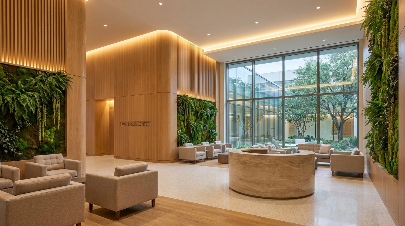
Throughout most of the 20th century, pale mint and seafoam green reigned unchallenged across global healthcare facilities, coloring surgical suites and recovery wards alike. Today, modern clinics and hospitals welcome patients with warm hardwood paneling, soothing mineral earth tones, dynamic circadian lighting, and lush biophilic gardens. The phasing out of institutional green stems from breakthroughs in optical neuroscience, environmental psychology, and evidence-based design.
"Modern healthcare design has moved decisively from cold sterile aesthetics to 'Healing Architecture', where daylight, timber, and biophilic textures actively regulate cortisol levels and foster recovery." — Journals of Environmental Psychology & Healthcare Architecture.
The Optical Origin of Surgical Green: Countering Photoreceptor Fatigue
Until the 1910s, surgical operating theaters were entirely white to emphasize microbiological sterility. However, pure white caused blinding glare beneath the high-intensity lamps of surgical luminaires.
Crucially, surgeons suffered from optical "after-images": staring continuously for hours at vivid crimson blood and suddenly glancing at stark white walls provoked retinal photoreceptor exhaustion, projecting disorienting green ghost spots onto the wall. Because green is the direct complementary opposite of red on the chromatic spectrum, painting surgical walls spinach green neutralized the phantom artifact, offering immediate visual relief to the surgical team.
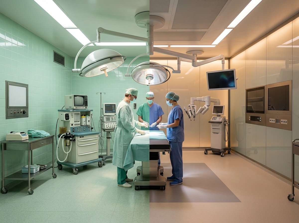
The Pathologization of Pale Green: Psychological Toll of Institutional Wards
While green performed its optical job in operating rooms, its blanket application across reception lobbies, corridors, and patient bedrooms created unintended psychological damage. Over decades, the hue became synonymous in the collective unconscious with sickness, chemical disinfectants, and confinement.
Under flickering cool fluorescent bulbs, pale green walls reflected onto patients' skin, producing a sickly greyish cast in bathroom mirrors, driving up heart rates, patient anxiety, and stress hormones.
The Paradigm Shift: Healing Architecture, Biophilia & Evidence-Based Design
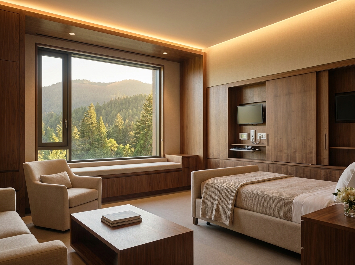
In 1984, Professor Roger Ulrich published his landmark study in Science, proving that patients in rooms overlooking nature and trees recovered faster and required substantially lower doses of pain medication than those facing bare brick walls.
This scientific milestone established Healing Architecture, built on three pillars:
Warm Earth Tones & Textiles: Oatmeal, soft terracotta, linen, and clay mimic luxury residential and hospitality settings, calming the patient's nervous system.
Living Biophilia: Rather than simulated green paint, genuine nature is woven in via courtyard healing gardens, floor-to-ceiling daylight, and certified timber wall paneling.
Circadian Synchronization: Intelligent tunable LED fixtures smoothly transition from 4000K daylight spectra to 2700K warm hues at dusk, supporting natural melatonin secretion.
Historical & Chromatic Evolution in Healthcare Architecture
| Era & Period | Predominant Palette | Technical Rationale | Psychological Outcome |
|---|---|---|---|
| 19th Century to 1910s | Absolute Pure White | Symbol of microbiological asepsis | Severe glare & acute eye strain |
| 1920s to 1980s | Mint & Spinach Green | Neutralized red blood after-images | Subliminal association with disease |
| Contemporary Era | Earth Tones, Wood & Biophilia | Neuroarchitecture & circadian rhythm | Lower cortisol & accelerated recovery |
Applying Healthcare Color Science to Residential Interiors
The therapeutic color and lighting lessons established in medical design now guide top-tier residential interior architecture. Restful master suites and inviting living areas rely upon the delicate balance of warm color temperature, tactile organic finishes, and muted mineral tones.
Expand your design knowledge by reading our guides on Bedroom Color Psychology, Smart Mirrors & Circadian Lighting, and Biophilic Design in Urban Apartments.
Simulate Restful Spaces and Therapeutic Palettes with AI
Ready to introduce soothing earth tones, warm natural wood, and biophilic living greenery into your home? Arquitet IA renders photorealistic 3D concepts from your room photos in seconds.
Try Arquitet IA TodayFrequently Asked Questions
Why was green originally introduced into 20th-century operating theaters?
Green is the exact complementary color to blood red on the chromatic wheel. When surgeons stare intently at crimson tissues and glance up at white walls, retinal photoreceptor fatigue produces floating phantom green after-images. Painting operating rooms spinach green neutralizes this visual optical illusion.
Why was institutional pale green eventually banned from modern patient rooms and corridors?
Over decades, pale institutional green became subliminally associated with chronic illness, chemical sterilizers, and clinical confinement. Furthermore, under cold fluorescent tubes, greenish reflections cast a sickly sallow hue on patients' skin, driving up stress, cortisol, and patient anxiety.
What palettes and architectural materials have replaced green in modern healthcare facilities?
Modern medical architecture prioritizes soothing mineral neutrals (warm beige, clay, sand), natural timber paneling, indoor healing gardens, and dynamic circadian lighting—proven scientifically to hasten recovery times and reduce pain perception.